How to Make Great Revit Elevations
Sep 10, 2024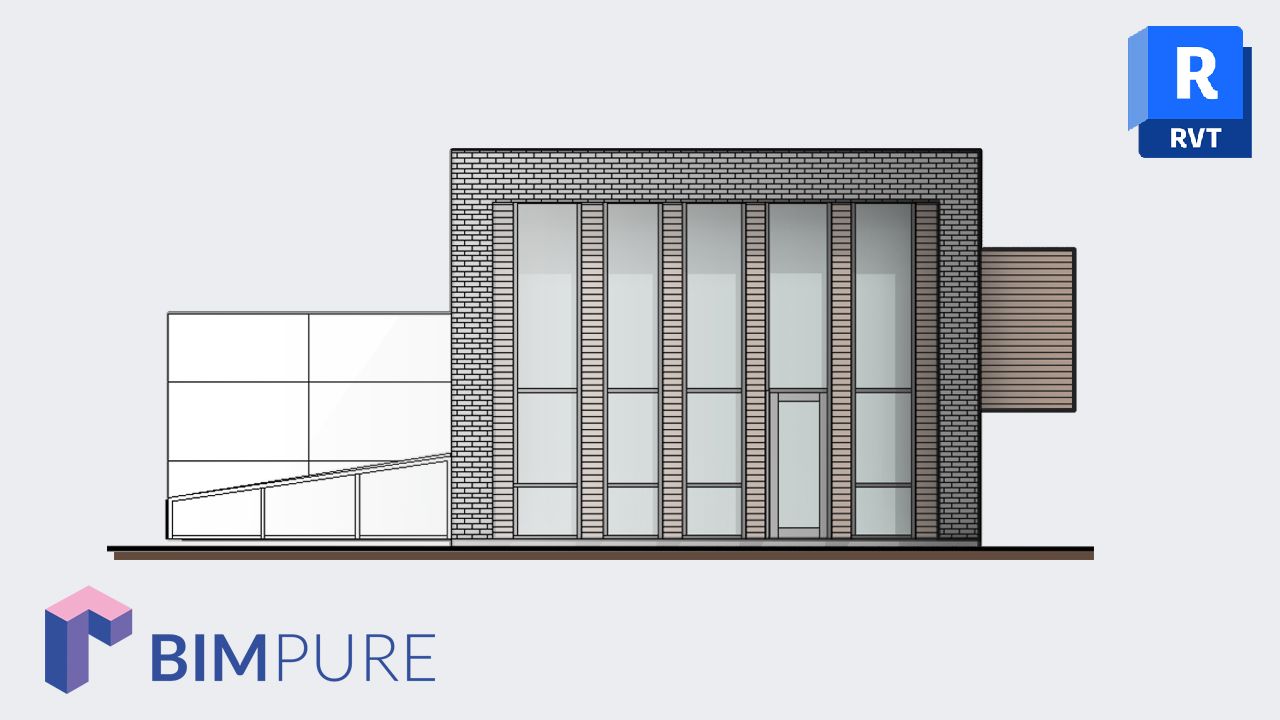
Remember these beautiful hand-drawn elevations that your architect grandpa used to draw? How much hierarchy and subtlety did they have? The attention to detail, the trees, the whole family strolling around the building, just enjoying life? They were not just elevations; they were works of art.
Of course, the BIM process completely sucked the life out of these drawings and gave us efficient but boring elevations. But does it have to be this way? Of course not. While we might not capture the same magic as before, a couple of steps and help from new features in Revit 2017 can help put some charm back into elevations.
Let's take a random Revit project, like this super secret research facility. Here is what it looks like in 3D.


What happens when we make a default elevation of this building? We got a boring, out-of-the-box graphics elevation. Don't tolerate this. You have to make this elevation as exciting as you can. Here are the 3 basic tools that will help you achieve this goal.
Access the Graphic Display Options by clicking the cube next to the sun icon on the view control bar. Set the Silhouettes to a linetype of medium width. I recommend Medium Lines, so between 0.3mm and 0.5mm.


Cast shadows immediately give your elevation a sense of depth. However, the default setting is too dark. Click Lighting on the graphic display option menu and set Shadows to 15 instead of 80. This makes the effect more subtle and easier for the eyes.


This tool fades elements based on their distance. You need to control each view individually with the Fade settings to get a decent effect.


Ambient shadows can be fun for presentation drawings or when using colored elevations. The problem is you can’t control the intensity of the effect, and it looks way too intense when using black and white visual style (see image below). Most of the time you should leave them off to avoid areas that are too dark in construction documents.

The Consistent Colors visual style is the best option for creating colored elevations. This is great for presentation views, although it's probably best to use the "Hidden Lines" tool for construction documents.

With the lineworks tool, you can manually adjust every single line in a view. The tool is located in the Modify tab, or you can use shortcut LW. The silhouettes tool has a broad effect on the view, and lineworks allows you to fine-tune the graphics.
However, this tool isn't recommended for construction documents. It is hard to control and manage, and cannot be included in view templates. This is best used for presentation documents.

Since the Revit 2019 release, you can use a double-pattern for materials. This is great in black and white views, where you might want to show darker materials with a solid grey background.
For example, maybe you want to make the wood material darker. Edit the material. Add a solid fill to the background pattern and pick a grey color.

This way, the wood looks darker in hidden line style elevations:

However, this will also affect the material's appearance in the Shaded and Consistent Colors visual style.

🔥 Save big: Get 20% off on all BIM Pure courses & content.
🧠 Get Revit Mastery: Access our full catalog of courses, templates, families, and live events.
Enter your details below to get this free guide.